Measurements are not important; it is how the equipment sounds to you that matters.
What if a high end speaker measures really badly?
You know, it's true that I feel listening is more important than measurements and that it's generally difficult to really tie together measurements with pleasure. Below 0.05% THD do I care? No I do not. I really don't care. The number tells me nothing about whether I'd like the amp more or not anymore.
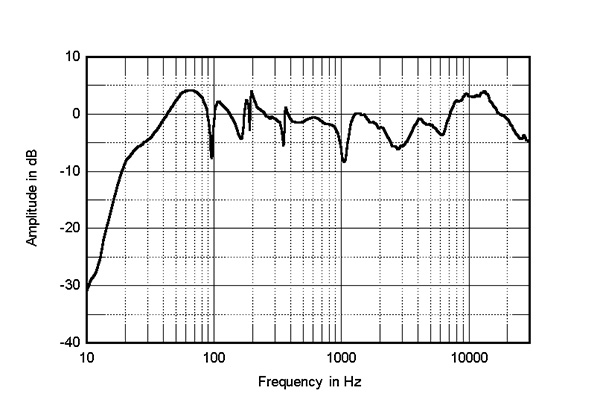
In this one memorable review for the Alta Audio Adam speaker, I really felt shivers go up my spine when I looked at the measurements, especially at ~$20kUSD. This looks like an absolute hot mess. Does it sound this bad though? I certainly don't have the $20K to test that out myself. What do you all think?
- ...
- 108 posts total
I’ll go out on a limb and assert that in the end, proper application of measurements always helps to achieve one’s hifi sound goals faster, more effectively and for less. The trick is to be able to understand and apply the numbers properly and I think that is not easy but a worthwhile goal for any audiophile. More good and reliable data informs better decision making. But the devil is always in the details. Practically though, each will end up finding their own way as best they can. Sometimes it’s the journey that matters more than reaching the final destination.
It’s all good. Cheers! |
@erik_squires - that's a very ragged frequency response graph. I don't think speakers have to measure perfectly to sound good - Wilson Audio speakers are not textbook. But there's a difference between small deviations and big ones. |
@erik_squires I don’t think we can say much of anything about that graph, and the others presented here without knowing the level of smoothing applied to the raw data. As I am sure you know anyone who has played around with Room Equalization Wizard software knows that you can make a washboard look like a pancake with adequate smoothing applied to the chart. It’s frustrating because that critical piece of information is very seldom supplied with charts such as these when published. |
- 108 posts total